Last week we had the pleasure of working with the Zoho CPA and finance divisions on putting together this webinar. If you are a CPA, accountant, or bookkeeper, be sure to check out the zoho.com/cpa division for partner opportunities. Regardless of whether you are a CPA, this session is extremely valuable for getting the most out of your Zoho Books with Analytics.
In this session, we cover the following:
- Why do you need a BI tool?
- How to set up your first data source, which in this case is Zoho Books.
- A complete overview of workspaces.
- And lastly, charts, pivot tables, & dashboards.
Why do you need a BI tool?
So what is the point of setting up Zoho Analytics and tying it into Zoho Books? The key thing is when you get Zoho Books; you’re going to get a bunch of reports that come right out of the box. Some examples are sales by item, sales by salesperson, unpaid invoices, etc. However, these reports often don’t give you the visuals or detailed analytics needed.
That is where a BI or analytics tool comes in. You will have a lot more options regarding how you want to view reports and what data you want presented. As you read on, we will cover this more in-depth.
How to set up your Data Source
Let’s get started with the initial steps required to get our data over to Zoho Analytics. Here are the step-by-step instructions:
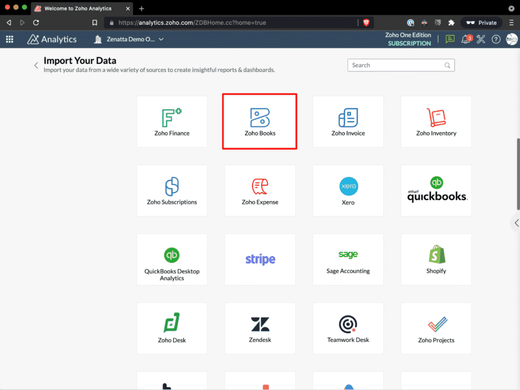
- Go to analytics.zoho.com
- On the top-right corner, click the green button Import Your Data.
- This will pull up the suite of all the pre-built connectors.
- In the search bar, type in Zoho Books, and go ahead and click on that connector.
- Note that products like Zoho Subscriptions and Zoho Inventory will also be included in this connector.
- Step 1: Give your Workspace a name and choose which organization to import the data. If you have multiple, select the ones you want to import.
- Step 2: Choose the modules and fields you wish to import. Be sure to check because, for example, it isn’t going to pull emails from customer records by default. Also, not on modules will be turned on by default.
- Step 3: Hit Next, and this will complete the process. Note that this does take some time to import fully.
- Lastly, return to your dashboard and verify that your data has been pulled into the Workspace you just created.
One extra thing to note is that you can have multiple connectors pull into one Workspace.
Workspace Overview
Now that we have the data source pulled into our Workspace let us review workspaces.
In the video tutorial, we focus on invoices. Keep in mind that the processes used could also reflect any data set.
Explorer is the first item you will notice on the top left corner of your Workspace. This view shows you all the data you have in the Workspace, their folders, and gives you the ability to search within them.
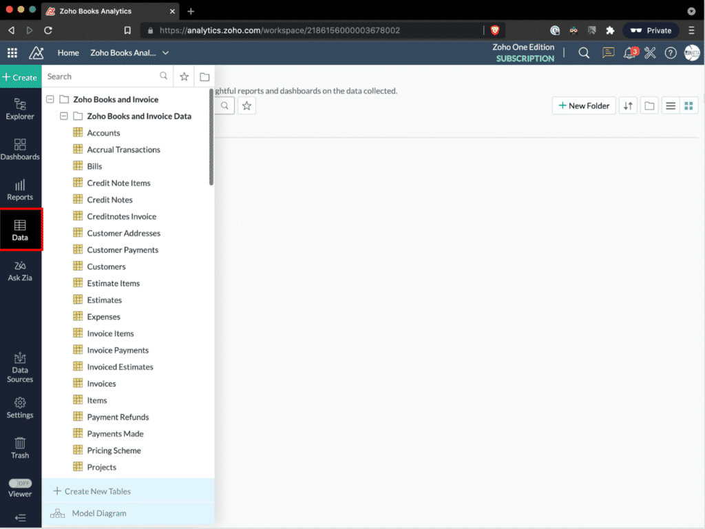
Data tab will have all of the tables you imported. Each data set will have its own unique table that will include all of the data you’d expect to see. For example, the Zoho Books invoice table would consist of Invoice ID, Invoice Number, Invoice Date, Invoice Status, Customer ID, Due Date, Discount %, Total, etc. One thing not listed, however, are the individual items. These reside in their own table, and each item has the Invoice number linked to it. Don’t worry, though; creating a report around this doesn’t require any crazy SQL or complex flows to marry this data.
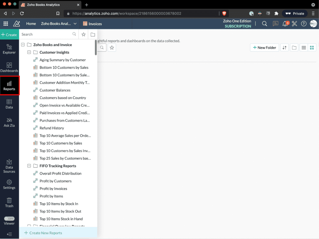
Reports are going to cover everything from pivot tables to charts, getting all rolled up into reports. For example, you can create a bar chart comparing sales between your employees or a pivot table giving you the same data. Another thing to note is that the default reports within analytics will cover 95% of the desired reporting. And for that other 5%, most will have the starting point which starting from something is better than starting from nothing.
Dashboards are a place to put more than one report and have several essential components to view. This is where you will have one URL to view all the critical data you want to see on one screen. Built into the dashboard are filters that can be customized and added as needed. These are powerful because they filter every report and widget that is on the dashboard. Widgets in the dashboard will be your call-out metrics that don’t necessarily belong on a chart or graph.
Working with Charts
To create our first chart, on the top left of our Workspace, click the +Create button. This is the master button to create all things. Once you hit +Create, a list of items will appear, including Chart View. For this example, click Chart View.
Next, we will want to choose which data source we want to pull in for the base table of this chart. When picking this table, you want to ideally pick whichever data set is above any other data you might also want to bring in.
Once created, you will notice on the left side a column with different related data items. These all relate to the main data table you chose to import that shares any relationship to the data set.
By clicking on any of these sets, you will then see all the various fields that come from that module. One nice thing about analytics is that it gives you some quick analytics such as Age in Days.
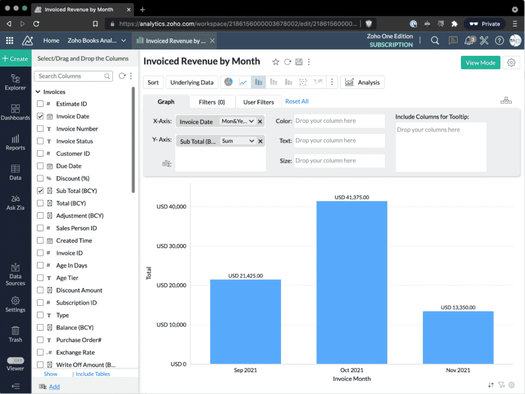
If you fast-forward in the webinar to 25:30, Tyler walks you through step-by-step on creating an invoiced revenue by month report.
Overall, charts customized to your desire are extremely powerful tools to see the data you want to analyze visually. And keep in mind you don’t have to choose your x-axis and y-axis from the same data set.
Working with Pivot Tables
A pivot table allows you to view data summarized in a grid in both horizontal and vertical columns. Creating one is very similar to how we described charts in the above section, and see how one is made from start to finish fast-forward to 38:00 of the tutorial.
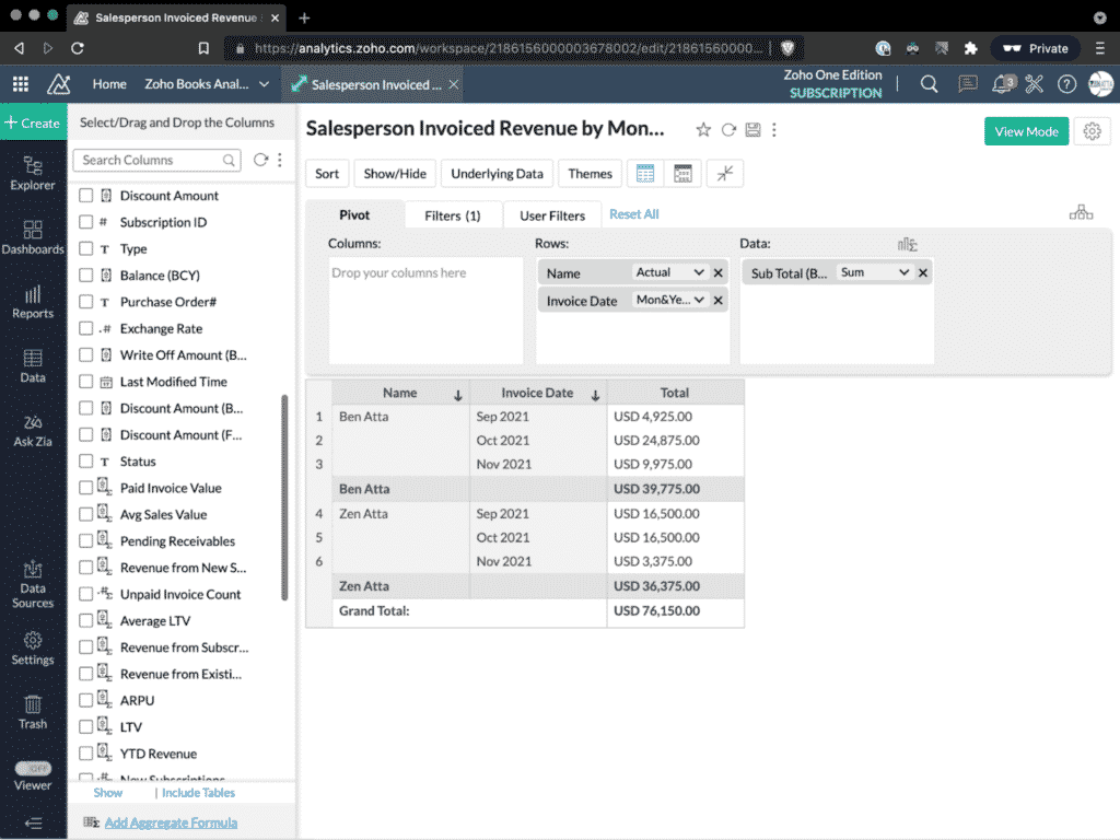
One key thing to note about Pivot Tables from the presentation is:
- Add Aggregate Formula is a way to get fancier with some logic or conditions when doing math with values. The great thing about this tool in Analytics is once you start typing in something, it will auto-suggest and fill things in for you.
Overall, Pivot Tables are very powerful for looking at a simple sum grouped by the user all the way up to looking at data over time with various groupings.
Working with Dashboards
Lastly, let us look at dashboards which is simply the way of looking at all of these things grouped up together. Once you have your various reports and charts created, your dashboard is a centralized place to view this data quickly and easily.
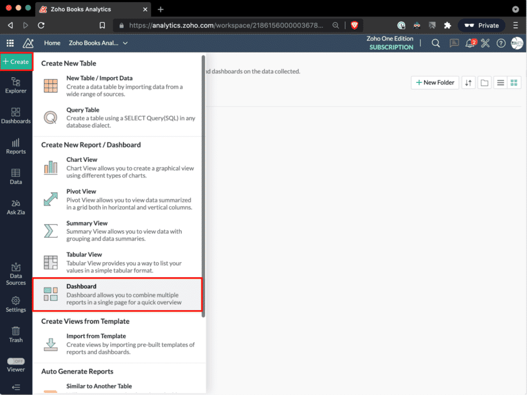
You can build your dashboard by simply clicking on the report you want on the left side and dragging it onto the main dashboard. Feel free to expand items by pulling on the corner of the item to make it larger. You can also copy and paste size dimensions to other charts that you drop in.
Once you have the different charts in your dashboard, add text headers to make the data easier to sort through and for others to understand the data quicker.
Pro Tips
- Get in the habit of good folder organizational habits early on to save you from a lot of time and headaches in the future.
- When making a dashboard, put the pretty picture data on top, pivot table breakdowns, and more tabular data on the bottom.
By using the +Add Tab feature, you can create filters for your table. Here you can pick the values from the data table you want to filter for your dashboard. You should always include the unique Timeline Filter, which can be found at the top of the list.
Don’t forget about widgets! These are also extremely powerful to put in unique values or targets you want to see on your dashboard, such as % to target goal or growth.
For the visual part of this tutorial, fast-forward to 47:05 of the presentation.
Need Professional Help?
Reach out to us and we’d be happy to help. Schedule a free consultation and see how we can help with your Analytics and Zoho Books.


