If you’re reading this article, chances are you’re trying to enhance lead conversion through your website. At a basic level, the purpose of a website is to inform potential customers about your business. You may have a compelling home page, an about page that explains why your customers should care about you and your mission, and likely a page discussing the services you offer. When your customer is ready to act, they will likely fill out a form on a call-to-action page. However, landing pages are slightly different. In this article, we will focus on creating landing pages to help your website convert more visitors into leads.
What is a Landing Page?
A landing page is where a potential customer “lands.” Often, there is no navigation to this page from your main site, meaning users are directed there through specific links found in emails or ads. Since the traffic to these pages is directed through some sort of marketing campaign, these landing pages can be specifically tailored to what you are trying to sell. As you read on, we will focus on landing pages as they relate to a larger marketing campaign and how they fit into your marketing strategy.
What’s the difference between a Call-To-Action (CTA) page and a Landing Page?
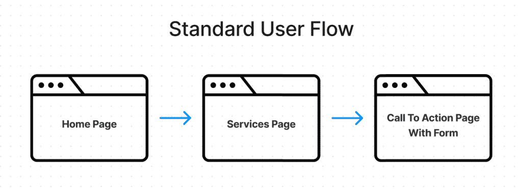
Call-to-Action (CTA) pages exist on your site as the final page a user will visit in your desired user flow: A user visits your home page, then clicks a button to Learn More, and finally, (hopefully) fills out your form. CTA pages have general content to provide information to anyone who may find that page.
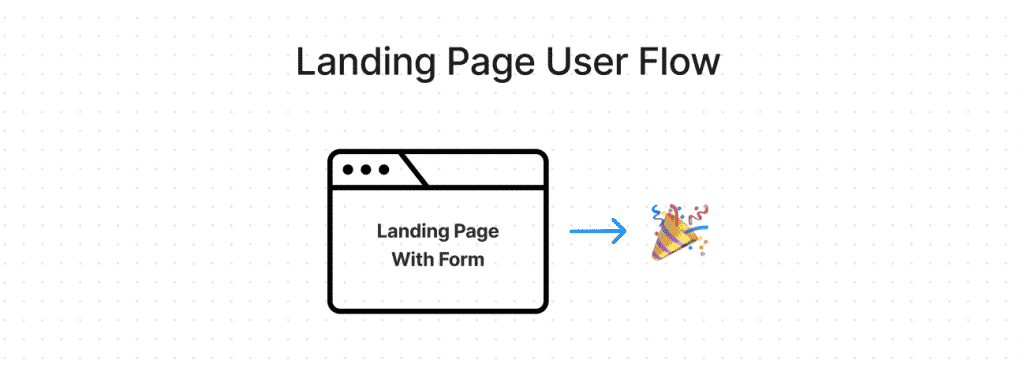
Unlike call-to-action pages, landing pages bring users directly to that page, not the home page. Users on a landing page typically click a button on an advertisement or email campaign and arrive at a landing page. Landing pages sometimes even exclude your main menubar, which helps focus your users on the content of the page. Landing pages also have a form directly on the page, so your users don’t need to click on another page to take action.
Fewer Clicks = More Leads
As you can see in the images above, Landing Pages remove several steps in your user’s journey throughout your site. Because there’s a chance for drop-off with each additional page a user navigates, allowing your users to take action on the landing page will increase your lead conversion. Another fun tip: research shows that changing the word “submit” on your button to something more catchy can greatly increase your chances of submission. Remember, you have one click, make it stand out!
Situations where you should use a landing page
Here are a few questions, and if you can answer yes to any of them, then a landing page is probably right for you:
- Do you have Facebook or Google Ads running and need a place for them to go?
- Are you running a promotion on your website?
- Do you need to provide users with content tailored to your email campaign?
Better Lead Tracking
We recommend creating unique landing pages for each ad you are running. Each page could have its own unique content, or the same content but on a separate URL. By having each page linked to its own campaign, you can track click data and form submission data on a more accurate level.
Using UTM Parameters to track where users come from

Have you ever visited a page on a site and noticed a bunch of extra characters at the end of the URL? The blue text in the image above shows an example of UTM parameters. When you run an ad campaign, you can set up the UTM parameters so that when a user clicks a link, it will bring along the parameters from the campaign. Then, when they fill out your website form, you can attach the original UTM parameters to their form submission. This allows you as a business owner to track the full journey that your user took and help you know exactly where they came from.
We recently did a full article about UTM parameters, click here to learn more.
Landing Page Content
Before we wrap things up, here are a few tips for content to think about on your landing pages.
- Is your ad coming from a specific platform i.e. Instagram?
- Throw the IG logo on your page, and thoroughly test the page for mobile users since that is where most of your audience will come from.
- Are you targeting a specific demographic?
- Maybe you have 2 ads running for different age groups. Tailor both landing pages to fit those age groups.
- Are they purchasing a service?
- Unlike physical goods which will take you to a shopping cart and checkout process, selling services can be a bit more tricky. Make your form simple and tailor the design to fit the page. It always looks goofy when your site looks modern and your form looks like it is a Windows 98 pop-up.
- Remember, the more data you try to capture that isn’t necessary to start, the more you potentially risk losing that lead. Noone likes long forms, we’ve all had that initial doctor’s visit with a million questions to answer. Just capture what you need, and then get the rest from them later.
Use Zoho LandingPage
In addition to the strategies mentioned above, leveraging Zoho Landing Page can significantly streamline your process of creating, deploying, and analyzing landing pages. Zoho’s platform offers an intuitive drag-and-drop builder, making it easy to design compelling landing pages without needing extensive technical knowledge. It seamlessly integrates with Zoho CRM and other marketing tools, allowing for an efficient lead capture and management process. With customizable templates designed for various campaigns and the ability to perform A/B testing, Zoho Landing Page empowers you to optimize your pages for maximum conversion. Whether you’re looking to launch a new product, promote an event, or gather lead information, Zoho Landing Page is a powerful solution that can help elevate your digital marketing efforts to new heights.
If you would like help creating landing pages or taking your existing ones to the next level, we are here to help. Visit Zenatta Web Services to learn more!
