What is Zoho Analytics?
Zoho Analytics is a business intelligence platform. A place where you can pull in a variety of data, either from Zoho apps or non-Zoho apps. You can report, compare, and consolidate all in one spot. Zoho Analytics has many pre-built connections, almost all the Zoho apps as well as outside applications like Google Ads or 3rd party marketing platforms.
Product Overview
Across the opening page of Zoho Analytics, you’ll see three main tabs, Workspaces, Dashboards, and Recent Items. Workspaces is essentially where you are going to send all of your data. You can easily view the data in the Dashboards tab. The Recent Items tab allows you to hop right back into what you were last working on.
Workspaces is where you will spend most of your time. This is where you will add data, create reports, and dashboards. Here is a walkthrough of all the main tabs within Workspaces.
- Explorer View – A top-down way to get to almost everything you need in a specific workspace. This contains all your folders, holding a variety of information from raw data to full reports.
- Dashboards – Sort all of your created dashboards into multiple folders for better organization. It’s common for each department to have its own folder.
- Reports – Contains every report in Analytics. You can sort these into folders as well.
- Data – Most of the time in Analytics you’ll be creating dashboards and reports, however, you can also open up raw data tables and make edits without leaving the system.
- Data Sources – Where all of your integrated applications are managed.
- Settings – Customize your workspace with a specific name, fiscal year, theme, and formatting edits. You can also manage what users have access to the particular workspace.
Settings for the whole application are in the upper right corner of the screen. Here you can customize Analytics for your organization by changing the logos or email addresses for auto-sending reports. Audit logs are highly recommended if there are a lot of people editing the data in the system. Other security controls and feature controls are available as well.
Data Sources // Data
In order to get the data sources set up you’ll need to integrate the applications. If you want different apps’ data to be able to interact with each other, we recommend adding them all to the same workspace. This will make it so all the data from each source will be able to work together in the same reports and dashboards. Additionally, you’ll want to configure the data sources right in Analytics so that you can manage it within Analytics and not in the other integrated app.
To add a new data source, click the green button in the upper right. This page will display all the predefined integrations that can be added with Zoho Analytics. In this tutorial, we add Zoho Desk and walk through all the settings to configure it. Each application will have slightly different integration settings to set up when adding the data source. A common setting to keep in mind is how often you want the data to sync between the source and Analytics. The current smallest window of time to sync is every 3 hours, or you can choose to sync daily. After completing the settings, the integration is ready to go. Data should start pulling in from the integrated app to Zoho Analytics within as little as 10 to 30 minutes.
Back in Data Sources, you will see the newly integrated application listed. Here is where you can view the last sync time and when the next one is scheduled. You also have the ability to manually hit the sync now link to sync the most recent data right away, not waiting for the auto sync. However, you are limited to 5 manual syncs in between each scheduled sync so keep that in mind! Clicking on the data source itself will give more specific information on that source.
You can find all your data in Data Tables. Within the tables, you can choose to show or hide particular columns. Sometimes not all the columns are needed for viewing but should be included for organization purposes, such as the ID number. Within this view, you also have the ability to manipulate the data with formulas or different data types. In addition, you might need to connect two data tables together in order to get the information to talk to each other. Data tables within the same application will most likely connect automatically.
Creating Reports
Now that you’ve pulled in all the data from the necessary sources and made sure all the relationships are created, you are ready to create some data visualizations! Use the create button to choose what kind of visualization you would like to make. When selecting your base table, it’s important to keep in mind that you will not be limited to only data from the base table that you choose. Once you get into the creation you will see this firsthand where the data options are on the side panel for you to choose from.
Tip: Search, don’t scroll! You are going to have tons of data within Analytics, save yourself time by using the search bar above the data options to find exactly what you need.
Often times you are going to want to pull reports based on account of something. When doing so, you are always going to want to use an ID. This will guarantee that you have a unique identifier, preventing accidentally using incorrect data. Keep your report meaningful by filtering out any data that doesn’t necessarily apply. After you’ve decided what data to use and have put that into your graph or whatever visualization you’re creating, you can format it to look exactly how you would like. Using the options to the right of the Underlying Data at the top, you can choose a different chart/visualization option. Make sure that you always hit save at the top, it will not save automatically!
In the settings cogwheel in the upper right corner, you can format your data visualization even further. Clean up your report by changing the names of the x and y-axis, as well as the number type. Under legend, you can edit the theme colors and title of your report. When using an app like Zoho Analytics, you want to think about what your workflow is like. Knowing the workflow will create an efficient process. For example, you can create a main report and use that as the baseline to duplicate and change out some of the data in the report.

Creating Dashboards
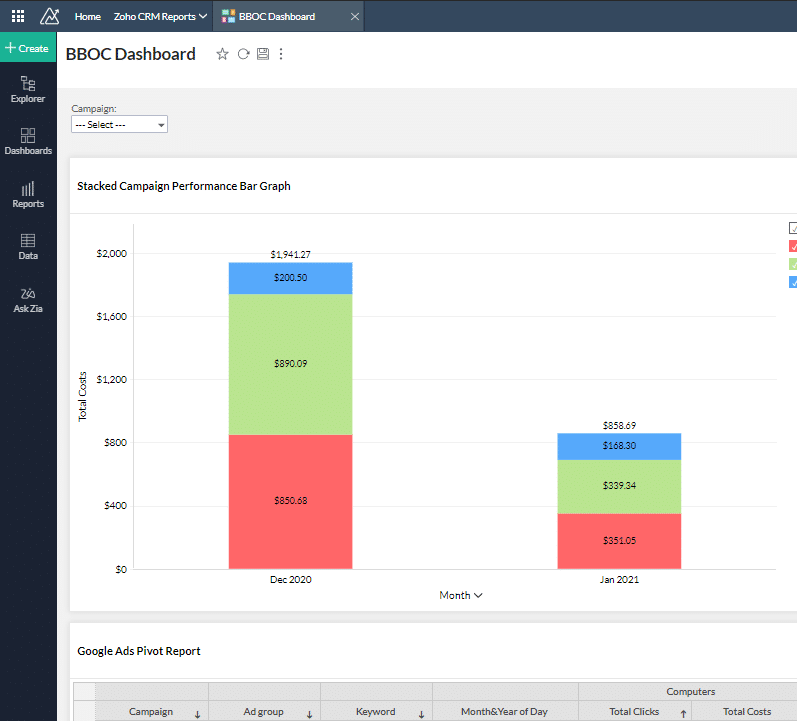
The purpose of dashboards is to take all the created reports together and view them all in one place. A lot of times to get the full picture, it’s helpful to have all the reports side by side. To create a new dashboard, hit the same Create button then select dashboard. Simply drag and drop whatever reports you would like to add, to the main page in the center. After you have all the reports you want on the dashboard, you can add KPI Widgets to give more detail. Widgets are helpful to give a more in-depth view of all the data you are capturing in the dashboard. Edit the widget settings similar to the report settings by renaming the labels, changing the colors, etc.
One of the best features of dashboards is the ability to have a filter that you can change on the fly that applies to all the reports at the same time. For example, if you wanted to view the reports for only a particular amount of time, you can set that filter for all the reports in the dashboard and easily view that information. You can add user filters to individual reports however, the generic timeline filter is specific to the dashboard. It will then apply that date filter to any of the dates within those reports on the dashboard. Add multiple filters to make it even more specific!
Conclusion
Overall, Zoho Analytics is an amazing BI tool that allows you to create whatever data visualizations you need! Learn more about Zoho Analytics by visiting our resource page!


