Data visualization is more than just a button in Excel. To make your point effectively, you need reliable charts that instantly reinforce and amplify your messaging. Murky or confusing data visualization will, at best, reduce your presentation’s effectiveness. At worse, you might find yourself losing deals without knowing why. No one will tell you that your simple charts made them doubt your credibility, but they might be thinking about it. Don’t make these common data visualization mistakes.
Avoiding Data Visualization Mistakes

How hard can it be? Consider our old friend the pie chart.
Pie charts are well-loved by visual designers, from corporate boardrooms to telethons. After the bar graph, pie charts are likely the best-known type of data viz. You’ve seen them in newspapers, textbooks, financial reports, and executive summaries. But despite our near-universal fondness for the pie chart, they are concealing a dark and fatal flaw: they’re terrible at conveying information.
To figure out what makes a good data visualization, we will look at a bad one: what, exactly, makes pie charts so bad?
Judgment Calls:
The human brain is very good at estimating linear relationships. It’s relatively easy to imagine how much longer one foot is than two feet. But non-linear growth is not nearly as easy for the brain to intuitively grasp. That means humans are fundamentally worse at understanding exponential relationships than linear relationships. Unfortunately, estimating the circle sector area is the fundamental basis of pie charts. You can prove that people are bad at this on your own: look at a pie chart. Each slice is almost certainly labeled with a percentage. If humans were good at estimating the slice area, we wouldn’t need to do that. Asking the audience for active analysis is asking too much.
Visual Work:
To compare the relative sizes of pie chart slices, the viewer must mentally superimpose a slice on top of the other. A bar chart makes this easy: simply track your eyes horizontally across the page from one bar to another. Correctly comparing circular segments is not so easy, requiring more time to make an accurate judgment and arrive at the correct conclusions about the data. Slowing down your audience’s understanding is rarely in your best interest. Don’t make your audience do unnecessary visual work to understand your data.
Limited Space:
You can likely judge what half a circle looks like. It’s easy enough to slice a circle in half, after all. But what about a slice that’s one-twentieth the size of the circle? What about a hundredth? Our ability to effectively interact with the circular area breaks down quickly. As a result, pie charts can only effectively show the relationships between a few things at once and lack the resolution to display differing magnitudes’ values – a requirement for most natural data sets. Slices showing anywhere from 1% to 5% of the circle are especially difficult to judge, and it only gets harder as their number of slices increases. Choose a data viz method that’s a good fit for the relationships you want to discuss.
Effectively use pie charts when showing two mutually-exclusive data sets, like answers to a yes-or-no question. Anything more complicated, and the chart falls apart. If you must use a pie chart, limit yourself to two or three slices at most, use it only for mutually-exclusive, non-overlapping data, and ensure each “slice” has an immediately apparent relationship against the other(s).
What Chart Should I Use?
Predictably, it depends on what you need to show. But most of the things that people want to graph are either change in one quantity over time or comparisons between related numbers, with or without time elements. For change over time (GDP, raw materials price), line graphs are well-suited. For the correlation between related quantities (profits per department, advertising buys by medium), bar graphs are ideal. But the two graph types share a long and blurry boundary, so don’t feel like you’re locked into one or the other. But in general, use line graphs for time comparisons and bar graphs for quantity comparisons.
Before you make anything, ask yourself if the data needs to be visualized. The purpose of visualization is to reveal relationships hidden within the data, using our visual senses to more deeply grasp the connections we might otherwise miss. If your visualization isn’t teasing out those kinds of connections, consider whether the visual element is helpful.
Sometimes, a table is better than a chart, and numbers don’t always need an accompanying graphic. This is especially true when the relative values of the data should not be compared (as we do automatically within visualizations) or don’t have much bearing on one another. When decision-makers need exact values, a summary table (called a Summary View in Zoho Analytics) may be a better choice.
Creating Useful Charts With Zoho Analytics
Zoho Analytics can help you create compelling, impact visualization that spreads your message and sell your story. You don’t need to know anything about data visualization to use it.
1. Upload your data to the Analytics system.

Under the hood, Zoho Analytics runs on a flavor of the ubiquitous database language SQL, custom-tuned for robust operations at enterprise volume. That’s good because there’s a good chance you store your data in an SQL-friendly format. If your data is in a digital format, you should be able to import it into Zoho Analytics.
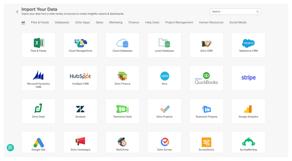
You can send data directly from your company’s database to Zoho Analytics, with support for most flavors of SQL, Amazon RDS, Postgres, and more. Zoho Analytics can also accept discrete data files in many formats, including XLS (Excel), CSV, HTML, JSON, XML, plain text files, and more. You can also pipe data from online storage services like Zoho Docs, Dropbox, Google Drive, Box, and OneDrive, or from any URL that provides a data stream.
2. Create visualizations using the Zoho Analytics tool kit.
Once your data is processed by Analytics, you can build visualizations rapidly. You can map out one data source against time (a “time series” in the data viz biz), compare multiple data sources, or produce a multivariate time series showing multiple data sets changing over time, each with their own Y-axis.

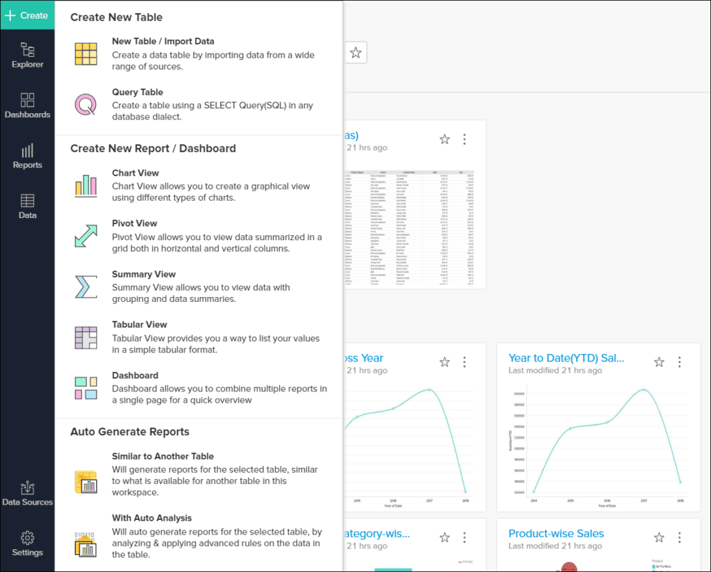
- Click the Create button in the upper left.
- Under Create a New Report, select Create Chart View.
- Drag the necessary data items from the sidebar into the “data shelf”, the area in the top half of the window. You can also tick the checkbox next to the data items, which will automatically place them into the field that Zoho believes is the best fit.
- Click on the Generate button to create your graph.
You can control which data is shown with the Filters tab, where you can drag and drop available filters to show only a portion of the data in your data sources. This is most helpful when restricting visualizations to a certain time window within a larger dataset.
You can also create dynamic user filters, which are displayed as dropdown menus in your visualizations that provide a dynamically-updated chart based on the user-adjustable filter that’s currently selected. If you’ve ever worked with Excel’s Smart Filters, you’ll recognize the utility of using filters.
3. Share your visualizations
Visualizations are often shared out of Zoho Analytics as images. These images work well in presentations, emails, and blog posts. You can also export views as HTML files, JSON, Excel files, and more.
Each export format is for a different purpose. Images are great in slide decks, while HTML is better for online data displays. A pure CSV dump will extract the underlying data from the chart, which can then be re-imported into another chart-making utility, database, or application.
Zoho Analytics doesn’t limit you to charts either. It can also create up-to-the-second live dashboards with the same drag-and-drop ease of static charts, build complex online data visualizations, and perform robust statistical analysis on your data, with full support for formulas and programmatic analytics.
New to data viz? Launch yourself in the right direction with Zenatta’s help.


